Tuesday, August 31, 2010

go jump in the lake

over the weekend billy and i headed over to historic grant park to the 8th annual summer shade festival.  it was a gorgeous day and we were loving the slightly cooler weather.  the highlight of my day was getting to see the booth belonging to the local art company “go jump in the lake.” 

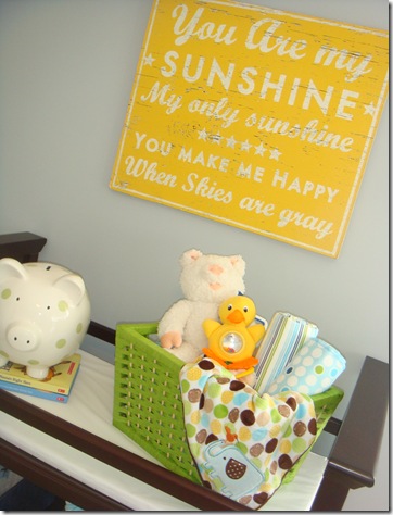
imagei’ve used their rustic signs in the past and have always loved them.  most recently i used one of their “lake” signs in a model home’s nursery.

DSC06592DSC06584 DSC06585

{images – charm home}

all of their signs are hand crafted and made to look like they’ve been exposed to the elements for years. 

lake 1

their signs with quotes on them are my fave.


lake 2

lake 3

i loved the wall of local atlanta neighborhood signs too.  it really reminded me how many great historic neighborhoods atlanta has.

lake 4

if you get a chance check out their website or purchase a sign from their etsy shop.

Sunday, August 29, 2010

dining table envy

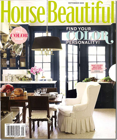
over the weekend i picked up one of my old house beautifuls.

image

i had forgotten how much i loved windsor smith’s home that was featured in september ‘09, especially the extra large dining table in the kitchen. 

image

i love how it functions as a dining table and as an island.  i wish my dining area was just a smidge bigger.  i love large, farmhouse-style dining tables, but my dining area is not large enough to hold one.  totally envious of windsor’s dining space though.

~~~~~~~~~~~~~~~~~~~~~~~~~~~~~~~~~~~~~~~~~~~~~~~~~~~~~~~~~~~~~~~~~~~~~~~~~i’ve been working little by little on my condo all this year.  i haven’t gotten much completed due to a lack of time, but it’s slowly coming together.  i’m looking forward to picking out something to add to my place from csn stores.  i’ll be reviewing a product soon for them and i’m really excited to pick out something fun.

**all images – house beautiful

Friday, August 27, 2010

The Right Proportions


My husband (the architect) and I have been up early looking at the progress of the hall this morning over a cup of tea. Looking at the generous space of the hall has inspired me to write about proportions today.

I'm writing an article for House & Garden at the moment about a house my husband designed. The owner, a reasonably conservative accountant in his 60s, told me how he gets up every morning and walks around thinking, "I just love this house!". When I tried to pin him down about what exactly it was he liked so much, it came down to the fact that the rooms were generous, the ceilings soaring and the windows looking out to the view were huge.

One of the best renovating advice I could give to anyone is before you build something, think carefully about the proportions of each room.

When we walk into a room and think "this is a really nice space" but don't really know why, its usually because the proportions are right. Have a look at the examples above: Ralph Lauren's villa in Round Hill, Jamaica with those gorgeous high ceilings and french windows or minimalist architect John Pawson's bathroom. Both have balanced spaces, windows in the right places and a ceiling height that feels right.

Too often, people start off with a nice design but cut corners with things like ceiling height and positioning of windows, usually on the advice of the builder. Don't do it, even if your budget is strangling your better judgement because you will have to live with it for a very long time.

Who knows, living in a house with the right proportions could even be the secret to a happy life!

{ Master Bedroom ~ Sneak Peak }

Sorry for all the "sneak peaks".
That seems to be all I have around here.
There's nowhere in this house that is complete.  Too much A. D. D. & 
not enough m. o. n. e. y. !
So, for now I'll offer little snippets of rooms.
The master bedroom is turning out pretty well. I like the layout, and the all the pieces I've put together in there.
Hopefully one snowy day this winter I'll paint the walls.
I hope to do some kind of wall treatment with wood and moldings & oatmeal painted walls .
But for now the green will do.  It's the only room in the house that was painted a color when we moved in in July.  I don't dislike the color, just want some more warm whites in the room. 
Enjoy!


I found this table above at a local thrift store I just discovered. ($20)
If you live anywhere near IMPACT thrift store in Montgomeryville, PA I suggest you get your butt over there.
It's AWESOME!  (But, leave some good stuff there for me)


some yummy white cotton ruffle sheets


chippy old frames, probably found in the trash years ago


some mis-treatments re-used 
from our other house


an old piece of wood I found in a friend's barn up the mountains.  It was already like this, I just hung it and laid some pictures on it.


more chippy


really exciting, I know...
some linen colored storage boxes from IKEA
to get the closet in shape.

More to come after I paint the walls, 
pray for snow, would 'ya?

giveaway update

last month i did a little giveaway from csn and jan from the life of a future domestic goddess won.  i thought i would share her entry/stairway project with you all because she used the credit that she won from csn to complete it. 

here is what her entry looked like before

beforeduring…

duringand the awesome after…

aftershe painted her stairs black and added a rug and light fixture from csn.  if you want to hear more about her entry/stairway update you can visit her blog here.

thanks for sharing your makeover

with us jan. it looks great!

Wednesday, August 25, 2010

{ chandelier }

some simple changes to the brass chandi 
turned it into this...


here's the before...


I used plain white shades from Lowes and edged them in clothes line rope.


I had super-babysitter, Ashley, hold a large moving box up in the air so the 
chandi was encased in it.
This made it possible for me to spray paint the chandi while it was still hung.


I still have some tweaking to do ~
  • paint the round thing at the top
  • make a cord cover
  • cover the walls in the room with some kind of wood treatment ~ I hope to make it look like it was once an outdoor room that's been converted.
{check out Funky Junk for some more great chandi ideas}

Monday, August 23, 2010

it’s that time again

with the 2010 college football season just 2 WEEKS AWAY i once again have orange and blue fever.  if you remember this post from last football season then you know i’m a huge auburn fan. 

here are some more images that i found for this year that will hopefully get you in the mood for some auburn football!

…or, if you aren’t an auburn football fan, then just sit back and enjoy the pretty orange and blue images.

blue and orange bedroom

{image – here}

{image – sarah richardson}

[blue-orange+decor+8+decorpad.com]

{image – here}

{image – southern living}

2009 Southern Living Texas Idea Downstairs Master Bedroom

{image – southern living}

{image – tobi fairley}

[James+Michael+Howard+blue+orange+bedroom.png]

{image – james michael howard}

WAR EAGLE!!!

Sunday, August 22, 2010

Gutsy Grey


I would call this London interior (from a recent issue of Living Etc) quite gutsy and bold. I love the masculinity of the deep colours and animal skins, softened by the unexpected girlishness of a hot pink velvet headboard and floral plates. Very British.

Friday, August 20, 2010

Glamping


These are the best fashion catalogue shots I have seen in a while. Ernest Hemingway's great-grand daughter Dree on safari in Africa for Louis Vuitton (via Habitually Chic).
Glamorous camping or "glamping" is really popular thesedays, although I am well known for not being much of a camper. One of my sisters and her husband are very outdoorsey and spend a fair amount of their holidays sleeping outdoors with their young kids. Occasionally we meet up for a picnic lunch at some picturesque camping spot.
Recently we were invited to go camping in the Southern Highlands with some journo friends. Needless to say, It was not a great success. My husband and daughter loved it but I ended up sleeping in my all-wheel drive Volvo to escape the swarm of bees circling my tent and the air mattress from hell.
There were many snickers behind tin mugs the next morning and I have to admit I was almost hyperventilating to get back to Bowral for a coffee. The secret to comfortable camping, so they tell me, is to have all the right kit and you have to be sure you like it before investing.
I do like the safari "look" but prefer to enjoy it at arms length, preferably in the pages of a LV catalogue, thanks very much.