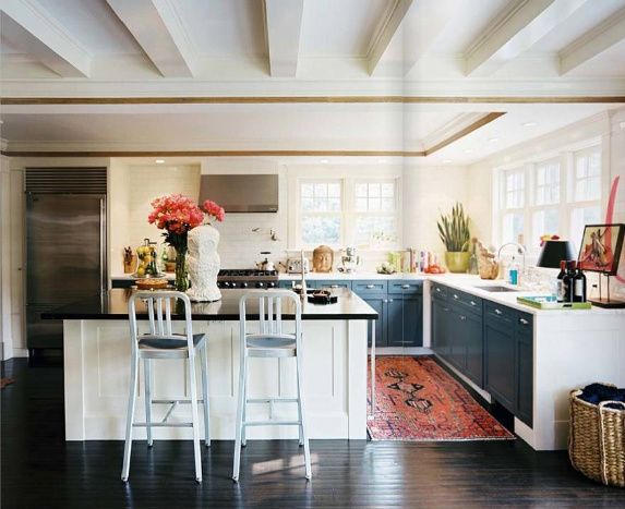


I'm noticing various shades of violet popping up here and there. It's a tricky colour to decorate with but always looks fresh when mixed with green or metal.


if i could build my dream kitchen i would build one with very few or no upper cabinets. i like the look of shelving but think i could do without them completely. while i was browsing through my kitchen inspiration files i realized how many kitchens i have saved that don’t have upper cabinets.

i love the task lights above the sink in this kitchen.
so pretty. this one is neck and neck with my favorite one.

{lonny}
{living etc}
{unknown}
{unknown}
and my favorite…


we have a winner!!! congrats to jan from the life of a future domestic goddess. looks like she’s well on her way to getting the new duvet that she wants with her new $60 credit from CSNstores.
thanks so much to all of you who entered the giveaway.
~~~~~~~~~~~~~~~~~~~~~~~~~~~~~~~~~~~~~~~~~~~~~~~~~~~~~~~~~~~~~~~~~~~~~~~~~
market: part 2
i started sharing some of my pictures from my trip to the atlanta market yesterday, and i’m going to continue with some more today.
roost steals my heart every show. all of their pieces have so much detail. catalog images don’t do them justice most of the time, so it’s so nice to get to see them in person a few times a year. felt was a big theme in the roost showroom this year and i was loving it.
sea life is very hot right now so bliss studio was dead on with their showroom. they got my vote for the most inspiring showroom color scheme. the blue and orange was beautiful.
vintage, vintage, vintage. it was vintage heaven at vagabond vintage.
studio a is a new line carried by the southern accessories today rep group. the recycled bamboo knot furniture pieces were so unique.
and the showroom where i saw my favorite piece of the whole market pretty much stole the show. regina andrew.
and that’s about it for this market. there were plenty of other showrooms that i visited, but i either forgot to get photos of them or my photos didn’t turn out well.
hope you all enjoyed my little virtual walk-thru.

if you haven’t signed up for the giveaway yet you still have time. make sure you enter to win $60 from csnstores.com. the giveaway ends at 6pm tonight and i’ll announce the winner tomorrow.
~~~~~~~~~~~~~~~~~~~~~~~~~~~~~~~~~~~~~~~~~~~~~~~~~~~~~~~~~~~~~~~~~~~~~~~~~
this post about atlanta’s market from last week and the week before is slightly overdue. it has taken me forever to weed through all of my photos. i didn’t realize i took so many. i snapped photos of cool things that i saw, but i also took photos of merchandise that i ordered. all in all i have about 500 photos to weed through. way too many!
i’m sure you all would get so bored if i showed you everything so i’ve narrowed it down to my favorites.
first of all, parquet flooring and rustic wood flooring in general was in quite a few showroom…barreveld, vagabond vintage, bobo, and more. i noticed it in january’s show but i think it was in even more showrooms at this show. it was very lovely.
{parquet flooring at vagabond vintage}
my favorite find for a new vendor was soleil de province.

bobo always has such a beautiful showroom. i could stay in there forever looking around. i love the mix of antique objects mixed with the new ones.
and go home had some very cool vignettes. the ghost bamboo chairs were fab!
to be continued…
i’m so excited to show you all a project that i completed about a month ago. this project was so much fun to work on. my client was AMAZING!!! she was so fun to work with and so open to new ideas. she was also super sweet. i miss our daily emails and conversations. it’s so hard to end a project because i know that i won’t be talking to my clients on a daily/weekly basis. strangely enough i usually talk to my clients more than some of my friends. that’s just the way it is. my clients become my friends…they know about my life and i know about theirs. it’s the absolute coolest relationship.
anyway, onto the stuff i know you want to see.
will’s room
so here is how will’s bedroom started out…(will’s new room was moved into caroline’s old room),
this was the design concept for will’s new room,
and here is how it looks now…

~~~~~~~~~~~~~~~~~~~~~~~~~~~~~~~~~~~~~~~~~~~~~~~~~~~~~~~~~~~~~~~~~~~~~~~~~
the playroom
next up is will’s and caroline’s playroom. the playroom was originally will’s room and it looked like this.
it’s come a long way. here is my original design concept.
and here is how the room actually turned out.
and the LH photographs.