Tuesday, June 28, 2011

From My Renovation Archive: The Bath House


For some unknown reason, I stumbled upon some long lost shots of a favourite renovation we did of our first beach house overlooking Jervis Bay quite a few years ago. This house is long since sold, but one of my favourite things was the bath house in the back garden. This quaint little sleep-out building, circa 1930, was too cute to demolish so we re-invented it.

If I had to do it again I would probably do much the same thing. The lesson to be learned here is that classic design does not date as quickly as decor that follows fads.

Monday, June 27, 2011

{ Guest Room Updates }

You can see what the guest room looked like before 
here, and here.
and now with some updates...


stop by anytime!
{and thanks for letting me get away without 
hardly and words in this post}

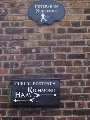
Petersham Nurseries


After a few days running around in London, my plan is always to spend a day out at Richmond with a visit to the very stylish Petersham Nurseries. This trip coincided with the Petersham House's open garden day, which made it all the more special.

We stayed at the nearby Petersham Hotel from where you can walk across the meadows to the village of Petersham which is like an old country hamlet in the middle of parklands in London suburbia. There's only a handful of houses, one of which is owned by the Nurseries owners, Gael and Francesco Boglione who bought the old run-down nursery almost a decade ago and transformed it into a model of garden style and eco-conscious practices.

Perhaps their best decision was to entice Sydney-born chef Skye Gyngell (sister of Nine Network chief, David) to cook for them in the restaurant and it now has a Michelin Star as well as a star-studded following. When we were there I was almost bowled over by the Rolling Stones' Ronnie Wood. An interior designer friend who lives in Richmond also adores the Nurseries and says last time she dined there Madonna was at the next table.

Lunch is served in the greenhouses on delightfully rustic vintage metal tables surrounded by vintage garden artifacts, old armoires, chandeliers and potted plants. This inspirational atmosphere feels more like a Lucianna Arrighi set for a movie than a plant nursery.

It was lovely to take a stroll around the gardens of the house. For me, the highlight was the kitchen garden which supplies fresh produce for the restaurant and the Boglione's conservatory. One of the main features of the garden is the 50 metre long herbaceous border - a very English folly which was flowering madly.

Sunday, June 26, 2011

House Love -it's in the blood!

A spot of Jane Austen, anyone? The thought of listed fountains and bridges is rather daunting.
Gorgeous hand-painted silk wallpapers - this green chinoiserie-style example is to die for.
The lovely coastal setting - but how cold would it get in winter?

The main reason for our trip to the UK was to celebrate a a milestone birthday with my father-in-law. It was also a chance for my husband to spend some time with his father where they were both born in the north of England.

No trip would be normal for us however without some sort of property diversion....
I feel a bit awkward writing about this but a good friend and blog follower has been asking and asking me to post about it so here goes.

Don't know if I have mentioned this, (probably not as I am slightly embarrassed to admit it) but in my spare time I have I have been working on the family history with my aunt and mother, really just putting it all on computer and doing some editing and online research. They have kind of handed it on to me to carry on the tradition. Lucky me.

Well, one day I was checking out some details on this rather adventurous great, great, great grandfather and googled his 'house'. Lo and behold up it popped on a posh UK property site, and it was for sale!

I had heard a few tales about the Scottish side of the family, but you know, you think "yeah, yeah, yeah". Well, this house was an absolute cracker. Designed by the most famous architect of the time, it is a Grade 1 listed estate complete with listed fountains, ramshackle but once manicured gardens, a fabulous listed bridge and rolling green pastures.

It was bought by the current owners from "the Family" about 20 years ago and it was too tempting to go and see it and consider the remote possibility of buying it back. Being married to an architect who is a heritage specialist comes in handy at times like these.

It is a long way from London, but we decided to drive up to the Highlands to check it out. "The Pile" as we call it, sits on a rise over looking the ocean, not far from Inverness. It is at the end of a long drive, hidden like a secret garden behind huge, ancient trees.

The house was the passion of my ancestor, an enterprising young Scot who was forced to leave Scotland because of the uprising against the English in the 18th century. He went to Madeira and founded the wine industry and then, as the eldest son, returned home to resume his family "seat" and built this fab house. He must have been as mad as I am about houses as he commissioned the most famous up-and-coming architect of the day, Robert Adam, to design it. Adam was Scottish, so my guess is that they knew each other.

Because of the cold climate, many of the original hand-painted wallpapers are still in pretty good condition and there are many old "Adam" fireplaces and features. Despite being well lived in over the years, the house is still in quite original condition, though a few of the lesser rooms were re-decorated in the seventies.

It could be an interesting project - what do you think?


Thursday, June 23, 2011

{ Boys & Baseball }

Recently I ran a 


Thanks for the great response!

I thought I'd share with you some of the designs I'll be working on.

one of my clients wanted help with her son's bedroom.
He's a 6 year old boy who LOVES the Philadelphia Phillies.
His room is already 
"Phillies" blue, with a few red accents here and there.
He's got some great pieces to work with, 
but needed a little umph.

I came up with this design board 
to help his mom create a fun,creative room 
that Luke can grow with, and still have that 
"All-American
baseball feel.

Luke's Baseball Room


Hopefully this can help you if your trying to create a room for your little slugger too!

Tuesday, June 21, 2011

Now You see Me..


I am back in the blogosphere having taken some time to recover and catch up with things since my trip to London, Scotland and Paris.
I have to share in some shopping highlights before I do anything else.

No trip to London feels right without an afternoon or two hitting the high streets. In the busy Oxford Street area I popped in to Liberty, Zara and Anthropologie.
Both Liberty and Anthropologie have fabulous merchandising and really quirky, imaginative products.

Eclectic style reigned at both stores with a big doses of crafty and hand-made accessories. Yes, there was even a bit a macrame spotted at Anthropologie. Bright colours were everywhere and texture was a feature at Anthropologie as you can see here.
Unfortunately I had to limit my purchases to what I could take on an aeroplane, but you will see some quirky knobs and cushions popping up in my beach houses shortly!

Coming up for all you style mavens out there:
Petersham Nurseries Open garden
London's East End Style

Monday, June 20, 2011

Baby Tucker’s Nursery

For the last year or more I’ve had baby on the brain.  And, not just my own!  It seems like every time I turn around someone else is having a baby and hiring me to decorate for their new bundle of joy.  Nurseries are probably one of my favorite rooms to design, so it’s been really fun to design all of them.

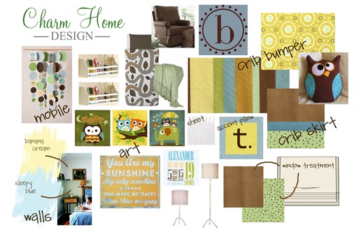
A few months ago I designed a baby boy’s nursery/guest room for a client.  Ashley, a graphic designer, contacted me and told me that she had an idea of what she wanted for her new nursery, but she was having problems pulling it together.  My Touch of Charm service was perfect for her because she wanted to be able to do a lot of it herself. 

Based on some ideas that Ashley already had, I pulled this design together for her.

baby tucker

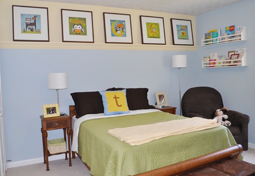
I rarely get to see pictures of the completed projects for my Touch of Charm designs.  Since homeowners can do these designs at their own pace, it can take a while for them to be completed.  I was thrilled when Ashley sent me pictures of Tucker’s finished nursery. 

crib2

Room1

chair

ChangingTablesign

pictures

Crib

Thanks for sharing your pictures with us Ashley!  Tucker is one lucky little boy.

**Ashley is a really talented graphic designer.  She actually helped revamp my brand and redesign my blog back in December.  She is also really easy to work with.  If you are in the market for a graphic designer you should check her out (Links below).

Ashley’s WEBSITE - - Ashley’s FACEBOOK PAGE

LiveJournal Tags: ,

Thursday, June 16, 2011

{ Decorating the Man Cave w/Maps & Thumbtacks }

Honestly, I'm having a hard time with the
Man Cave.
It's still pretty dark & dreary.
Even with it's new floor and freshly
painted dry wall.
Gone is the 1954 Mahogany Paneling.
But, it's just not working.
One problem is the dark wood built ins.
Danny DOES NOT want them painted, 
Boo-Whoo.
So I need to figure something out to liven this place up
without it looking like a 
Mom Cave.


Part of my solution...
M A P S
they're cheap, easy, & 
the colors are
P E R F E C T I O N!


see?  right?
is the ocean not the perfect shade of bluey/greeny?
I MUST color match it and use it somewhere.
Maybe the ceiling in here.


okay, so P.S. ignore the 1997 TV.
also, the maps are attached with thumbtacks.
signed, Getting There

Wednesday, June 15, 2011

{ 10 Steps to Creating An Outdoor Room }

We live outdoors in the summer.
We are lucky enough to have a screened in porch right off out kitchen/den.
So, to make things simple, I created little 
"stations" where we can easily find the most common used items without 
traipsing through the house.


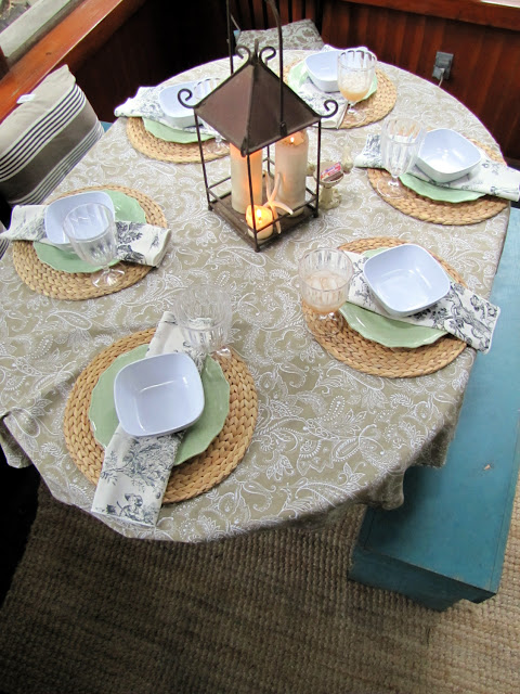
1st - set up an area for things you need to dine outdoors.
Plates, bowls, utensils, napkins...
whatever ~ 


2nd - Create a cold drink area.
Here I turned a wagon base & a sewing machine stand 
into an instant cooler spot.
Fill with ice & and a variety of your favorite drinks.


3rd - Have a little basket on the floor
 for flip flops & sandals 
to be tossed into 
{so much easier than searching the house for shoes when the kids want to go out}


have matches on hand for 
candles, BBQ's, & outdoor camp fires


The porch opens up to the den half of our kitchen.
So, it's a nice spot to entertain in the summer months.
I'd love to paint the stucco, but that's a whole 'nother
can of worms.
{but, if you insist, I'll do a post with my future colors & plan for the exterior of the house}
oh, go on , twist my arm.


4th - Carved out a spot to store other essentials.


Coloring books, crayons, bug spray
sun block ... fill in the blanks


and, of course 4 baskets full of stuff 
dedicated to Play-Doh


yes, I found this yellow piece of furniture on the side of the road {trash}.
I left the drawers there, cause they didn't shut very well.
These baskets do just fine.


5th - Add some lighting.
We strung white lights around the room 
and bunched up mini paper lanterns in the corners.


6th - Have a place to sit & eat. 
The table is is a left over from our last house.
It's the white IKEA one you've seen EVERYWHERE.
The benches work great for seating a good amount of bodies, but don't take up to much room.
I paid for the benches, but the black chairs? trash.
go ahead, grab a girlfriend and drive around your neighborhood the night before trash pick up.
It's a free & easy "Girl's Night Out".
I highly recommend it.


7th - Add some comfy outdoor pillows
to the backs & seats to cozy it up a bit.


Once you've bathed in bug spray, 
step outside.


8th - Throw an old quilt and some pillows 
on the hammock and you're sure to find someone asleep there
at some point in the day.
{hopefully a kid}


9th - Add fire.
Making a fit pit couldn't be easier.
My husband use the frame of an old 
fire pit and surrounded it with large rocks.
End of project.


It's a classic spot to roast 
marshmallows.


10th - Create a spot to hold your drink.


It's gonna be a long hot summer,
 so you'll want to have a tall, cold drink
standing by...


We used these stumps to create
end tables around the entire fire pit.
We had enough stumps so that each chair
had at least one stump next to it.


So there you have it.
{10 steps to creating your own outdoor room}
You don't need thousands of dollars to
create your own
outdoor living room.
Just an imagination.
Have fun with it, and your friends will too!


&